 Loading pageLoading pageLoading page
Visual Branding · 2024
Packaging, marketing, and brand design for an organic farm with too much honey to sell.
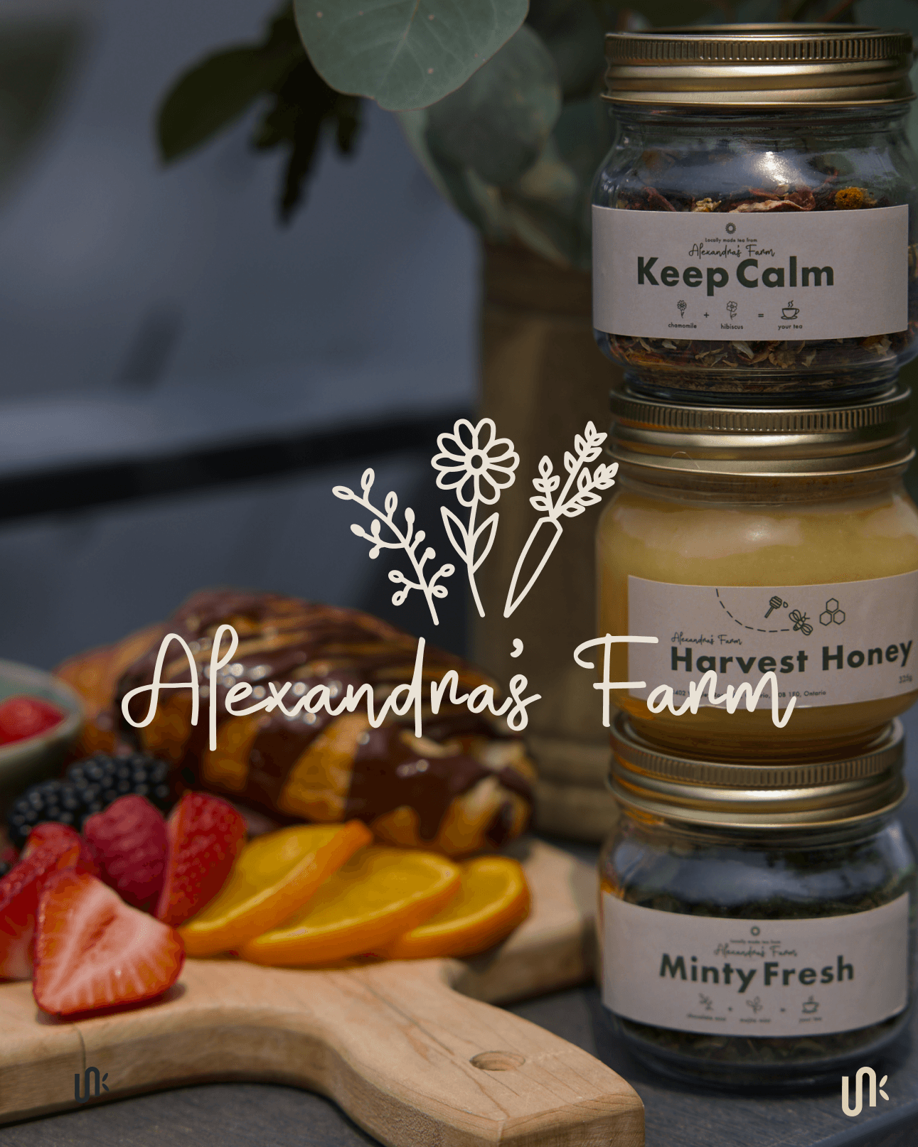
Alexandra’s Farm is a small organic farm in Ayr, Ontario, producing flowers, fruits, vegetables, herbs, tea, and honey. In fall 2024, as the CSA season was winding down, Alexandra had tea and honey ready to sell before the holidays but no formal packaging system to help customers understand the products.
At farm booths, Alexandra regularly had to explain the different tea blends and honey products to customers. Without clear labels or a connected packaging system, every product depended on a conversation before someone could understand what it was. The packaging needed to make each product easy to identify while preserving the simple, handmade character customers already associated with the farm.
Alexandra had already developed the tea blends and produced the honey. Jaia Studio created the product names Keep Calm, Minty Fresh, Sleepy Tea, Flower Blend, and Honey Harvest, then built a consistent label structure around the collection. Each product could have its own name and ingredient details while still looking like part of the same farm grown family.
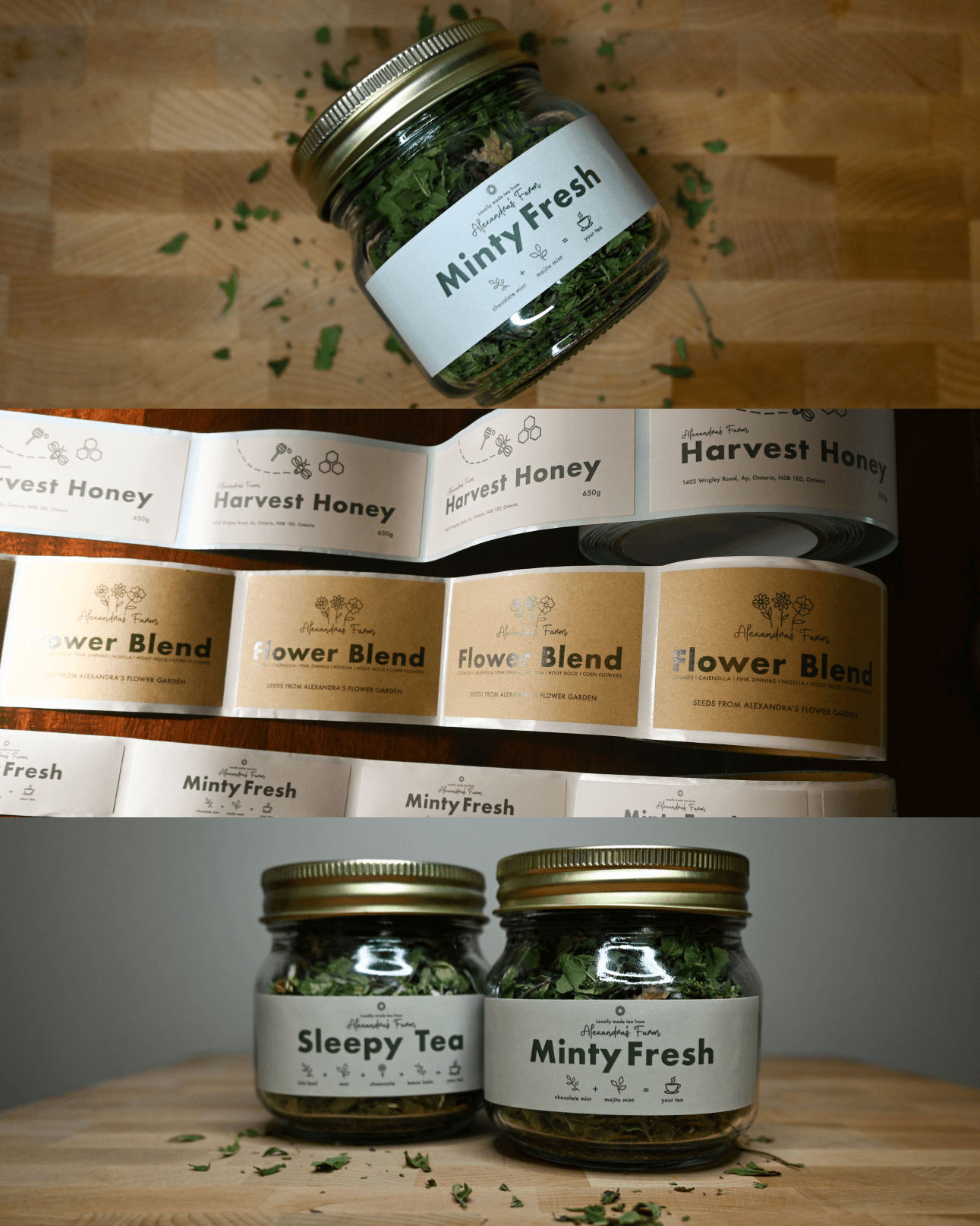
The packaging used one recognizable structure across the tea blends, Honey Harvest, and flower seeds. Clear names, ingredient illustrations, botanical linework, bees, and honeycomb details helped customers distinguish the products while keeping the collection visually connected.
The system was designed to support the products Alexandra had ready for the holiday season while remaining useful for future batches and seasonal releases.
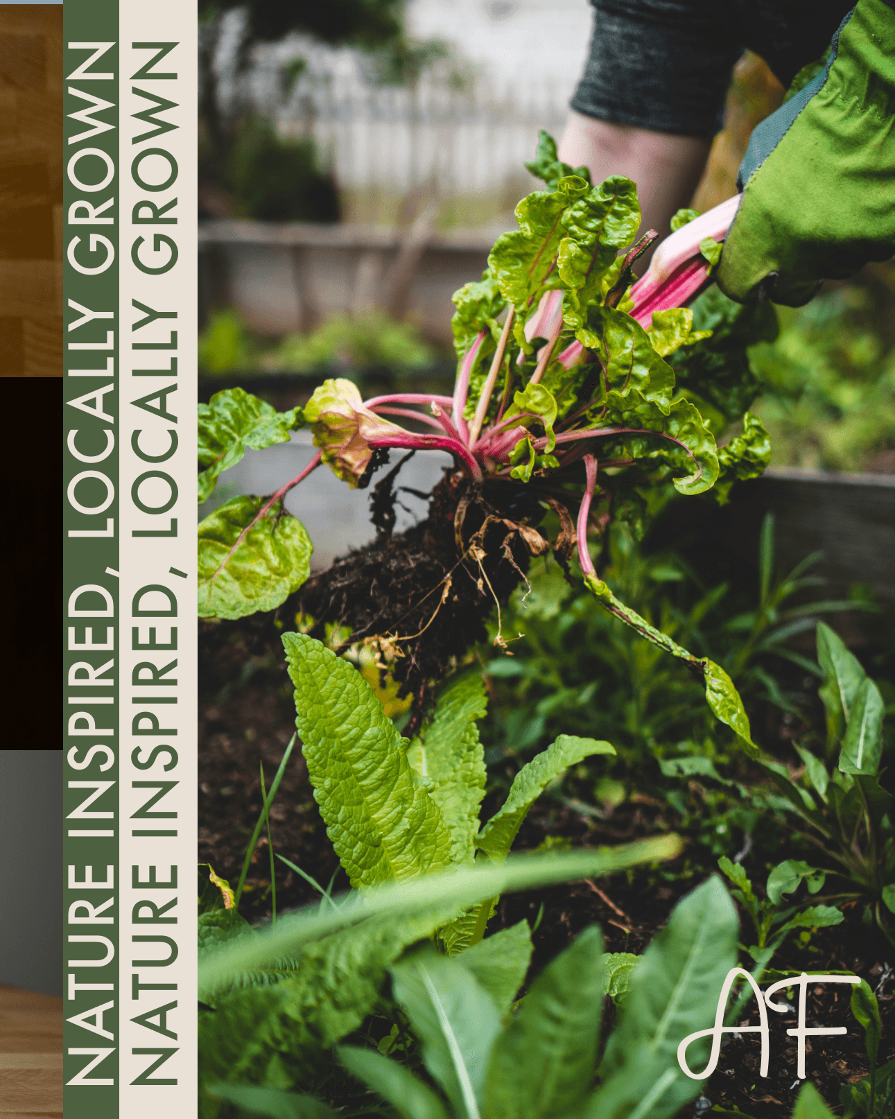
Alexandra did not want packaging that felt overly polished or disconnected from the products. A manila inspired base, simple typography, and hand drawn illustrations created a system that felt down to earth, organic, and personal.
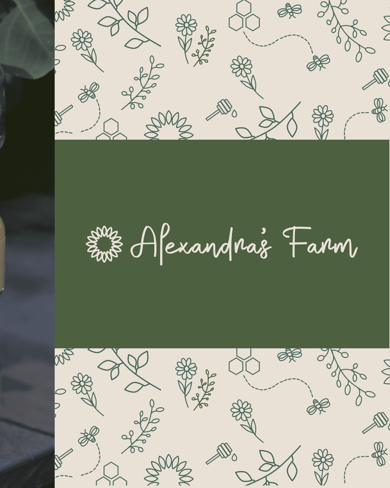
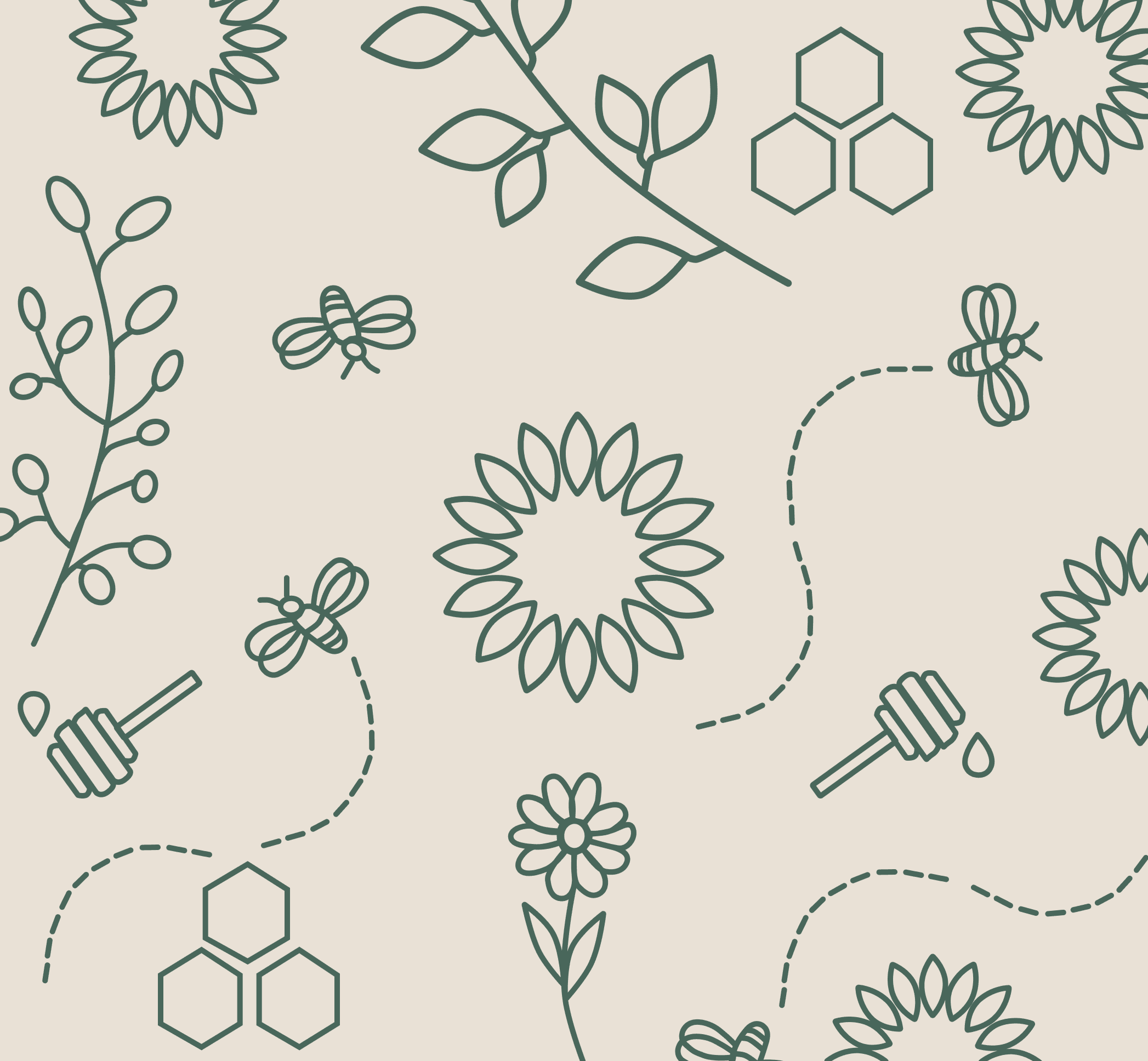
Jaia Studio illustrated fruits, vegetables, flowers, tea ingredients, bees, and honeycomb elements from the farm. The illustrations could work individually on labels or come together as a larger botanical pattern.
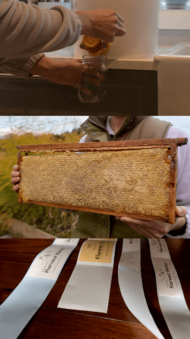
Jaia Studio extended the identity into product styling, photography, videography, social content, and reusable social templates. The same handmade visual language could move from jars and tea packaging into market promotion and holiday content. The Honey Harvest behind the scenes video documented the product and packaging in use, giving Alexandra additional content for introducing the collection.
“Jaia went above and beyond in designing packaging for our products and creating content for our social media accounts. She shared her ideas and inspiration and enthusiastically brought them to life. It was a pleasure to work with Jaia, and we will continue to use her services. I loved working with her.”
Tell us what has changed and what is no longer working. We will tell you whether the project should begin with strategy, branding, or a full brand and website.