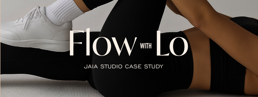
Pilates Branding Case Study: From Classes to Certification
- Jen Drews
- Mar 18
- 4 min read

When Lo came to Jaia Studio, she wasn’t just building a Pilates brand.
She was building something that needed to evolve.
Yes - she was teaching classes, but she also wanted to create something that could grow into:
• a recognizable method
• a personal brand
• a platform for teaching other instructors
That meant we weren’t just designing for where she was - we were designing for where she was going.
The Starting Point: A Brand That Feels Grounded, Not Performative
One of the first things Lo made clear was what she didn’t want.
She didn't want the brand to be:
• overly feminine
• something that felt like a tropical retreat
• something polished to the point of feeling disconnected
Instead she imagined:
• Down-to-earth
• Relatable and a little bit quirky
• Welcoming for all genders
• A space where people could learn, not perform.
That clarity gave direction because branding doesn't start with visuals.
It starts with defining what the brand should feel like and who is it for.
The Concept: Movement as an Everyday Ritual
As we explored different design directions, one idea kept coming back:
This isn’t just about Pilates. It’s about how movement fits into everyday life.
That’s where the concept of city yoga + everyday ritual came in.
Not something you escape to but a place you return to.
A practice that feels as natural as your morning coffee.
A space that meets you where you are.
That idea became the foundation for the entire brand.
The Process: Three Design Discoveries
For every custom branding project at Jaia Studio, we start with three design discoveries.
Each one explores a different interpretation of the brand’s personality, positioning, and potential.
For Flow with Lo, these concepts focused on:
• grounding vs energy
• structure vs flow
• personal brand vs scalable system
From there, we refined the direction that felt most aligned - not just visually, but strategically.
Because the goal isn’t to pick what looks best.
It’s to choose what will work long-term.

The Visual Identity: Built to Feel Human
Once the direction was clear, every design decision came back to one question:
Does this feel real?
To bring that to life, the visual system was intentionally crafted to feel:
Soft, but not delicate
Structured, but not rigid
Expressive, but not overwhelming
The color palette blends a mixture of copper rose, warm browns, light pink, sage green, dusty teal, and linen.
Together, they create something grounded, calm, and slightly unexpected.
Nothing feels overly polished, and that’s exactly the point.
The Details: Where the Brand Becomes Personal
One of the most important parts of this project was making sure the brand didn’t just look good - but that it felt like Lo.
Instead of relying on generic elements, everything was built with intention.
All illustrations were hand-drawn to give the brand a unique identity.
We incorporated:
• subtle references to Lo’s personal tattoos
• symbolic elements like the Taurus zodiac
• small design details that make the brand feel lived-in, not manufactured
These are the kinds of decisions that people don’t always notice immediately.
But they feel them, and that’s what creates connection.
Designing for Growth: Classes, Content, and Certification
This is where the strategy becomes critical.
Flow with Lo isn’t just a pilates and barre class instruction business.
It’s evolving into:
• a personal brand
• an online teaching platform
• a certification system
That means the brand needed to work across in person classes, social content, educational materials, instructor training courses - and it still needs to feel cohesive.
So instead of designing something overly niche or restrictive, we built a system that could expand, and an intentional brand that could grow with the business.

Why This Matters for Wellness Founders
When thinking of a logo or a brand most people start at the wrong place. They design a brand for what they’re doing right now - with no intentionality of where the business is going, who it's for, and how it will evolve.
So when they start to grow, they feel stuck. (I get a lot of inquires that start with 'my business doesn't feel like me anymore)
• They outgrow their identity.
• They lose consistency.
• They have to rebuild everything from scratch.
But when your brand is built with intention from the beginning, growth feels different.
It feels smoother, more aligned, and a lot more sustainable.
The Outcome: A Brand That Feels Like Home and Has Room to Grow
Flow with Lo is now positioned as more than a Pilates offering.
It’s a brand that supports:
• Movement
• Connection
• Education
• Expansion
And most importantly: It feels like Lo.
Because the strongest brands don’t feel forced, they feel natural.
Are You Building a Brand That Can Grow With You?
If you’re a wellness founder thinking about:
• Expanding your offers
• Teaching others
• Building a personal or larger brand (branding a studio, gym, retreat centre)
• Creating something long-term
• Your brand needs to support that vision.
If it doesn’t, it will slow you down.
If you’re ready to build something intentional Inquire for custom branding with Jaia Studio
Not sure what's the best next step for your business?
Then fill out our 30 second brand assessment quiz to get a personalized guide for your next step: Get your score
Because a strong brand doesn’t just support what you’re doing today.
It supports what you’re building next.


Comments