 Loading pageLoading pageLoading page
Visual Branding · 2025
A celestial identity for a new chapter devoted to astrology and intuitive guidance.
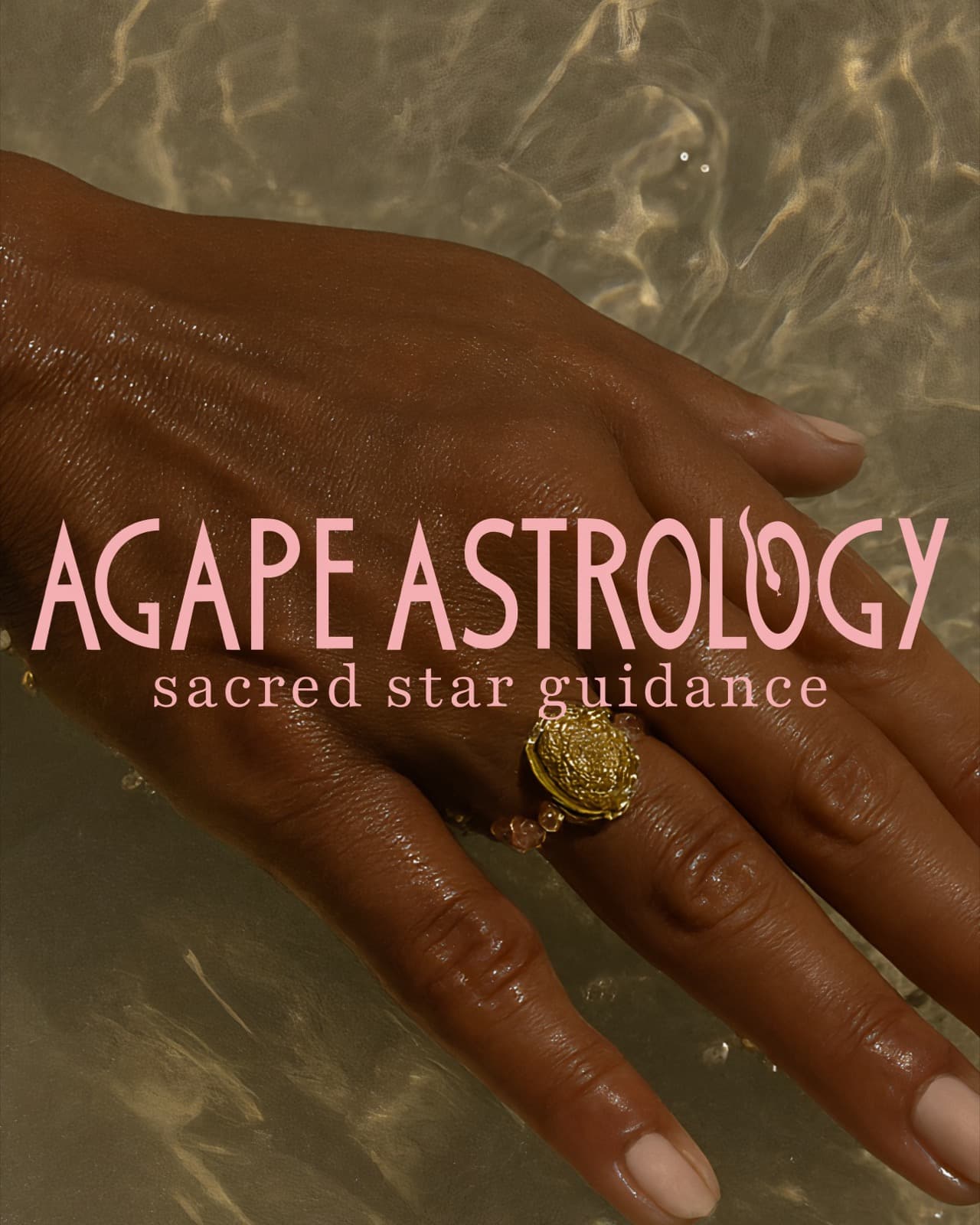
A complete visual identity that helped Nicole move from Stars and Crowns into a dedicated astrology practice rooted in guidance, transformation, and divine feminine energy. Nicole was already practicing astrology and offering readings alongside her work as a hairdresser. Under the name Stars and Crowns, the two sides of her work existed together, but she wanted to make astrology and intuitive guidance her primary professional focus. She created the name Agape Astrology for that next chapter and came to Jaia Studio for a complete visual identity that could introduce the practice with greater intention and recognition.
Agape Astrology was designed primarily for women between 30 and 60 who are navigating a transition, considering an important decision, or looking for a deeper understanding of an experience from their past. Through birth-chart readings, astrology guidance, and intuitive readings, Nicole wanted to offer an experience that felt sacred, intimate, feminine, grounded, supportive, and transformative. Jaia Studio created the phrase “Sacred Star Guidance” to give the practice a clear verbal anchor and distinguish the work from casual horoscope content.
Agape is a Greek word associated with selfless or unconditional love. The name also created a meaningful connection to Nicole’s Greek heritage and the caring, spiritual quality she wanted the practice to hold. The visual direction built on that foundation through divine feminine symbolism, celestial references, cycles of change, and the idea of receiving guidance during an uncertain season.
The identity was designed with the composition and symbolism of tarot cards in mind. Custom stars, moons, planets, goddess figures, hands, and celestial motifs created a visual language that felt intimate and mystical while remaining recognizable. Snake imagery introduced the idea of rebirth, transformation, and shedding an earlier version of yourself. The seated feminine figure became a central mark for reflection, intuition, and divine feminine energy. Earthy green and terracotta brought warmth and groundedness to the identity. The palette helped the brand feel ancient, feminine, and spiritual without becoming overly dark, theatrical, or disconnected from the women Nicole wanted to support.

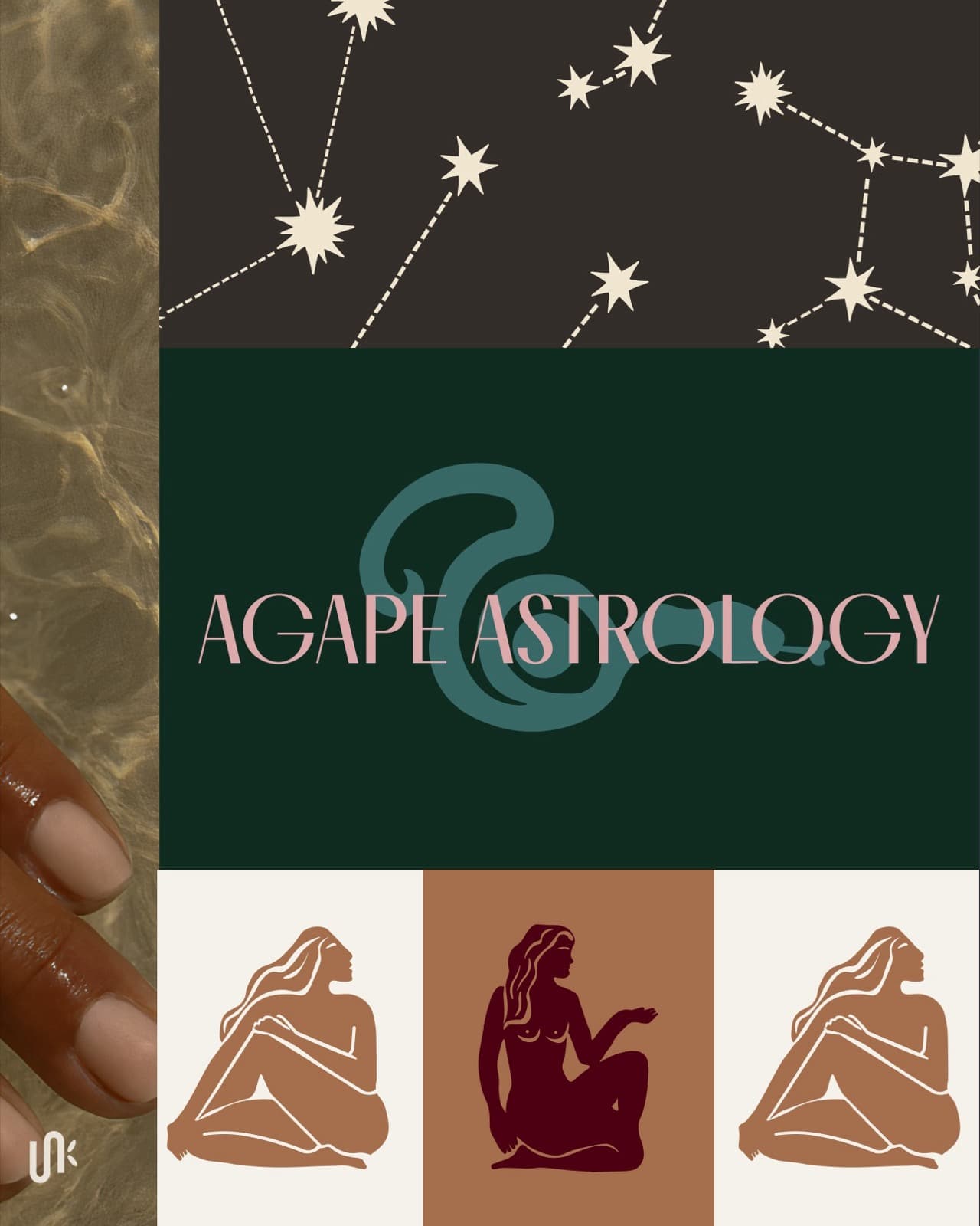
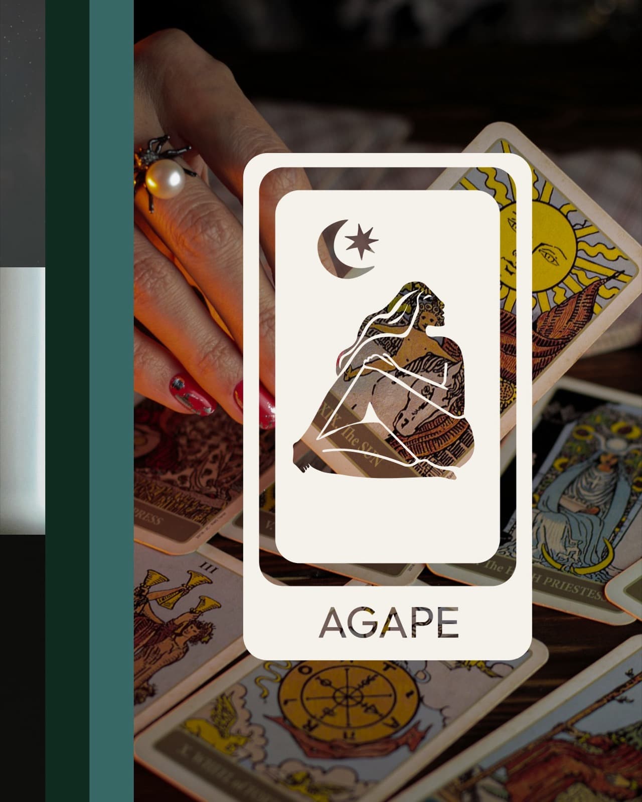
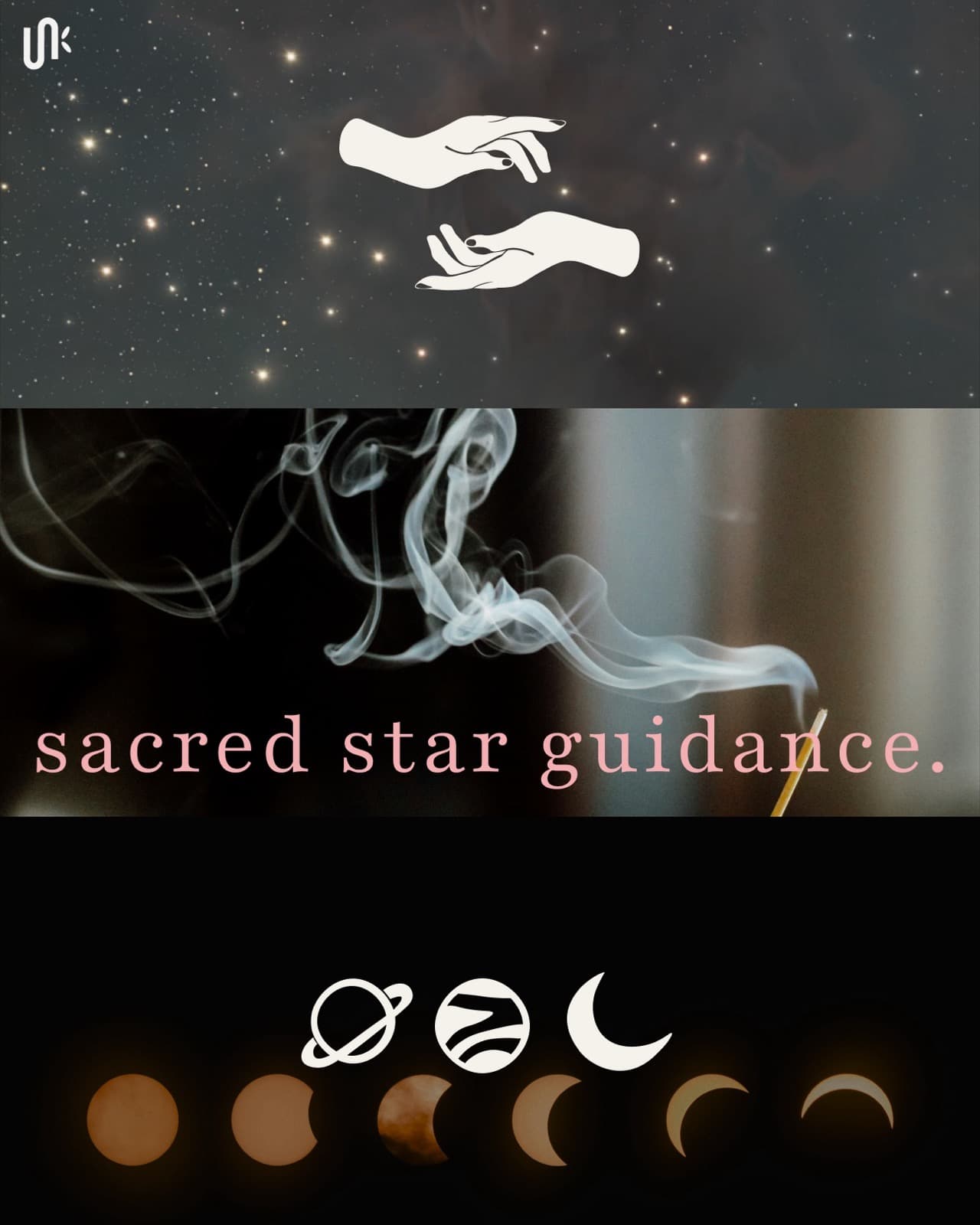

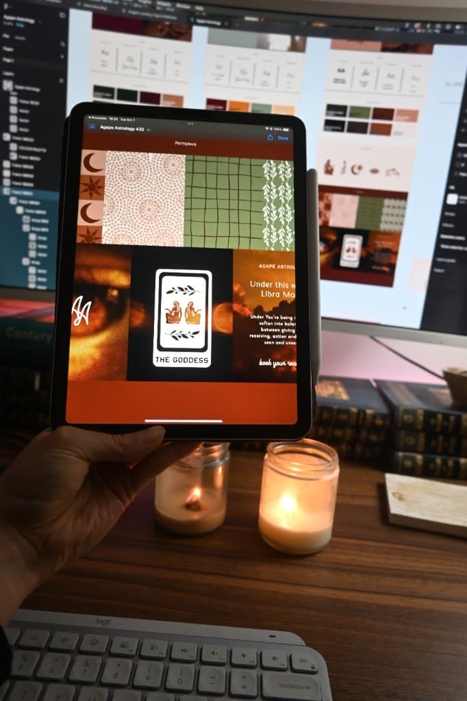
Nicole publicly launched Agape Astrology with a complete logo suite, celestial icon system, custom patterns, typography, and colour palette designed around guidance, feminine energy, and transformation. The completed identity established Agape Astrology as its own recognizable practice rather than an extension of Stars and Crowns. Agape Astrology remains active today.
Tell us what has changed and what is no longer working. We will tell you whether the project should begin with strategy, branding, or a full brand and website.