 Loading pageLoading pageLoading page
Visual Branding · Brand + Website · 2025 to present
Pilates and florals brought together through naming, branding, and a website.

Lydia was already a certified Pilates instructor with an interest in florals and a long term vision for a wellness business. What she did not have was a clear way to bring those ideas together. Jaia Studio helped turn the early concept into Florencia Wellness, a welcoming brand built around movement, creativity, learning, and connection.
Lydia originally imagined opening a permanent wellness space. With an existing job and a five year vision for building the business, moving directly into a physical location would have created unnecessary pressure. The stronger path was to begin with events, classes, private sessions, and community building while creating a brand that could eventually grow into a space of its own.
The strategy positioned Florencia Wellness as more than a Pilates business or floral workshop. It became a third space where people could move, make something, learn, socialize, and feel connected. The experience was designed to feel welcoming enough for mothers and daughters, friends, and women looking for a joyful way to spend meaningful time together. One idea guided the experience from the beginning. Everyone who attends a Florencia Wellness class or event should feel welcome.
The original working name was Lively & Co., but it did not reflect the direction Lydia described. As the strategy developed, flowers, growth, femininity, and community became central to the brand. Jaia Studio recommended Florencia Wellness as a name that could hold those ideas while leaving room for the business to expand.
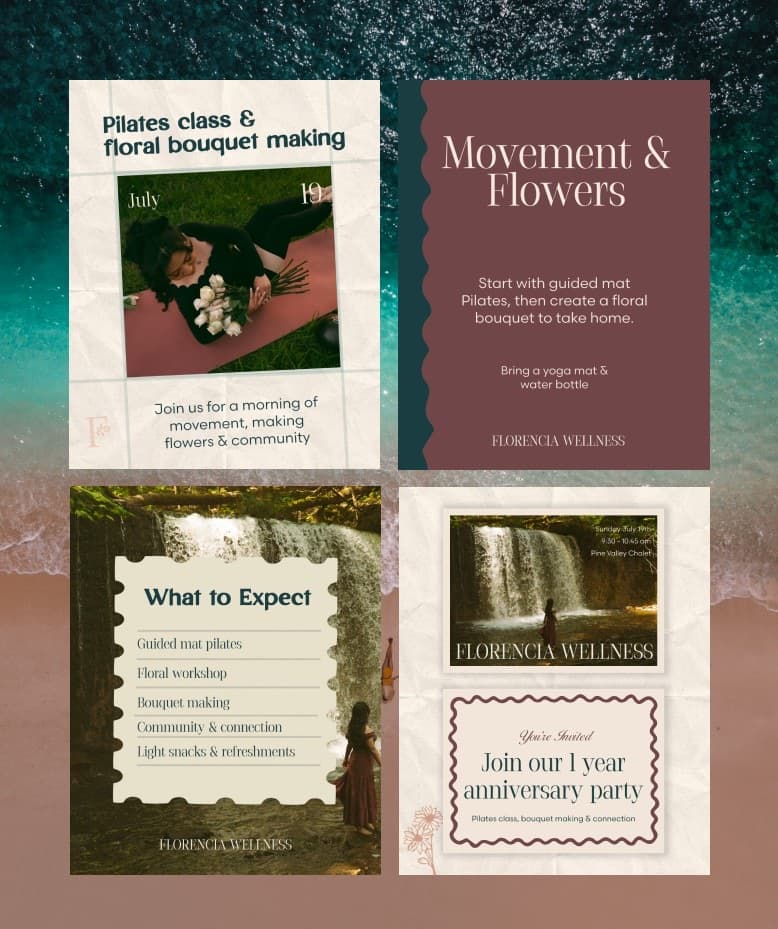
Instead of asking Lydia to choose between Pilates and florals, Jaia Studio recommended combining them. Lydia developed Petals and Pilates as a signature event where movement, creativity, and social connection could exist together. The concept gave Florencia Wellness a more memorable place in the local wellness market and a practical way to begin building community.
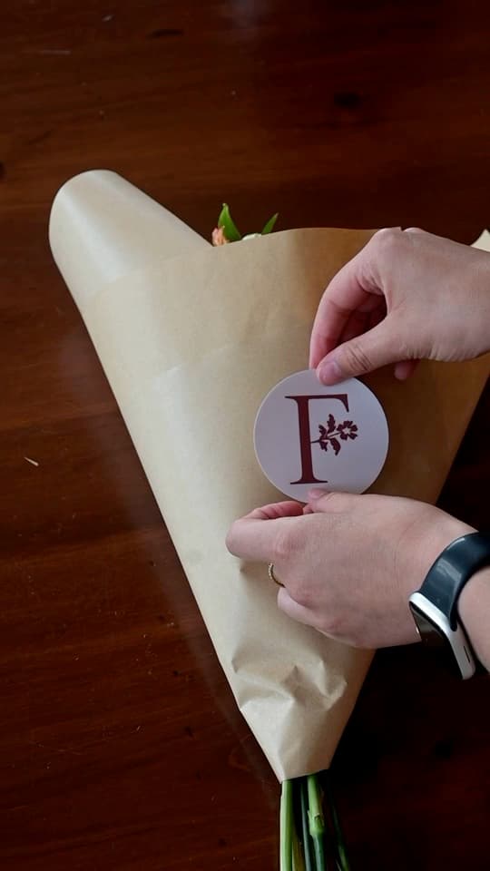
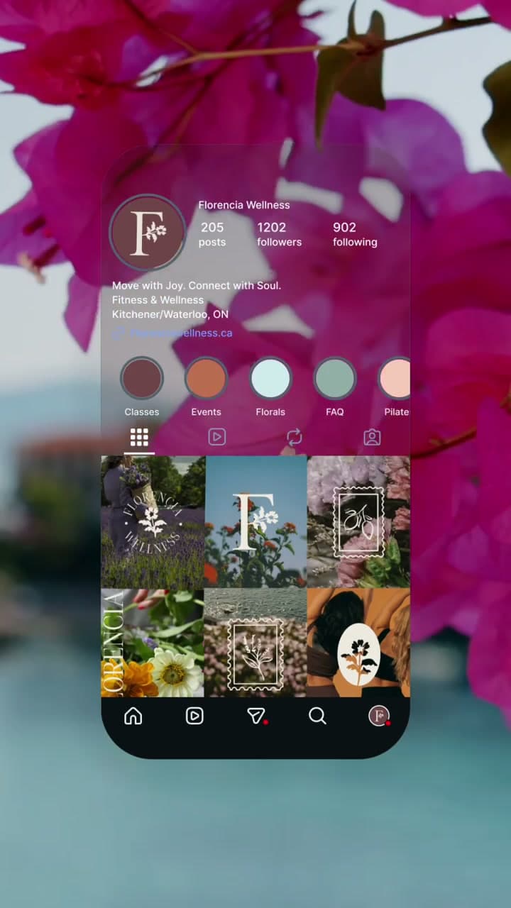
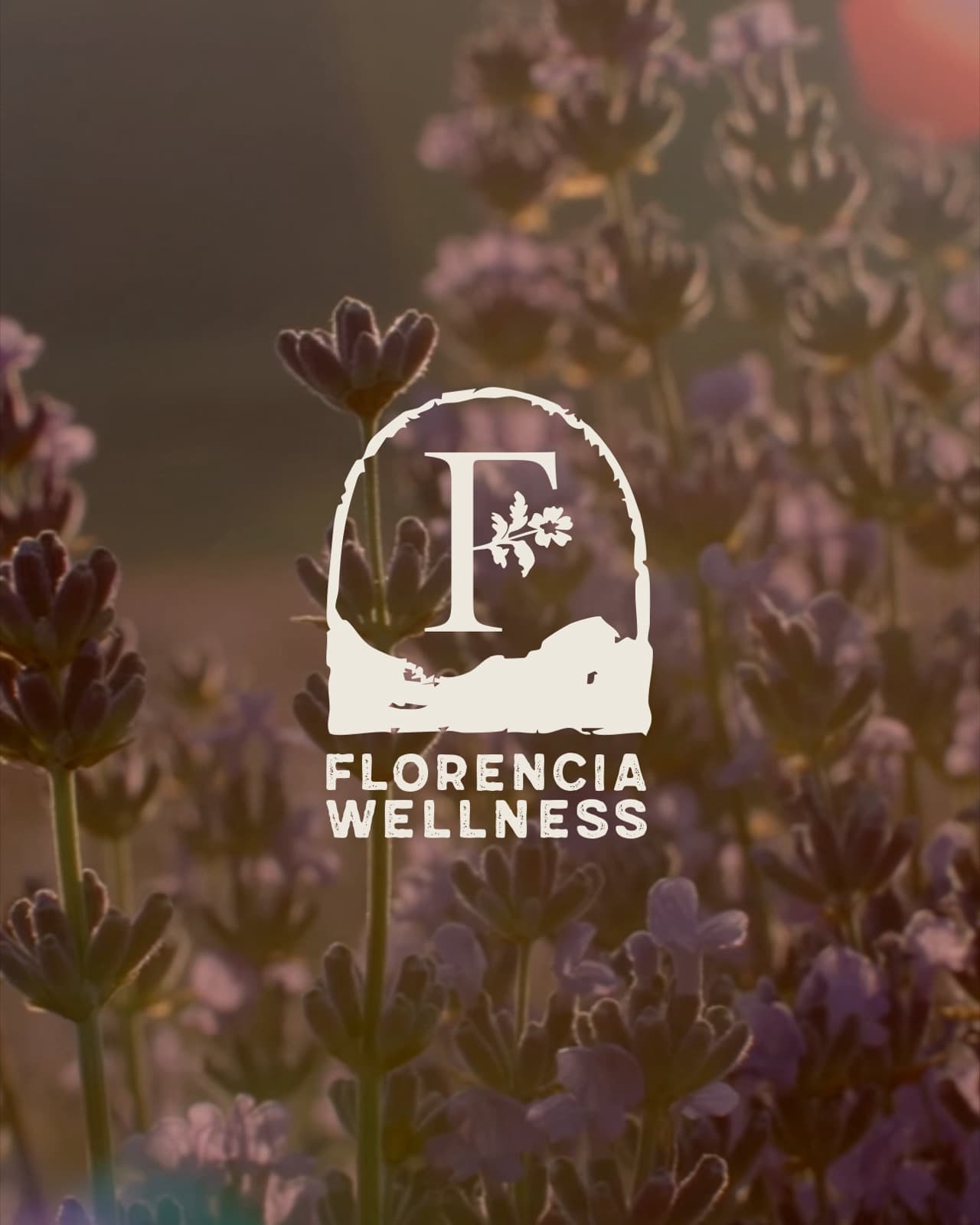
The visual identity began with Lydia’s preference for lavender and grew into a palette drawn from real flowers. Tile colours and references from Oaxaca added warmth and depth. Expressive typography balanced femininity with a rustic quality so the brand could feel delicate without becoming fragile or overly polished. Custom floral illustrations, icons, patterns, and stamp inspired graphics gave Florencia Wellness a flexible visual language for classes, events, social content, printed materials, and future experiences.
The website introduced Petals and Pilates as a signature experience while giving Lydia room to expand the business. Visitors could understand the concept, explore classes and events, and move toward the right booking or inquiry path. The structure was designed to support Pilates classes, private sessions, community events, floral workshops, and future offers without rebuilding the website every time the business entered a new stage.
After launch, Lydia began filling classes, booking events, growing an audience, and expanding the Florencia Wellness offer. She also became certified as a florist, strengthening the floral side of the business as it continued to develop. Jaia Studio continues to support Florencia Wellness through monthly social media design, event marketing materials, printed promotions, monthly themes, and signature event campaigns.
“I honestly could not have done this without Jaia Studio. She helped bring this idea to life, encouraged me, and connected all of the different ideas I wanted into one brand.”
Tell us what has changed and what is no longer working. We will tell you whether the project should begin with strategy, branding, or a full brand and website.