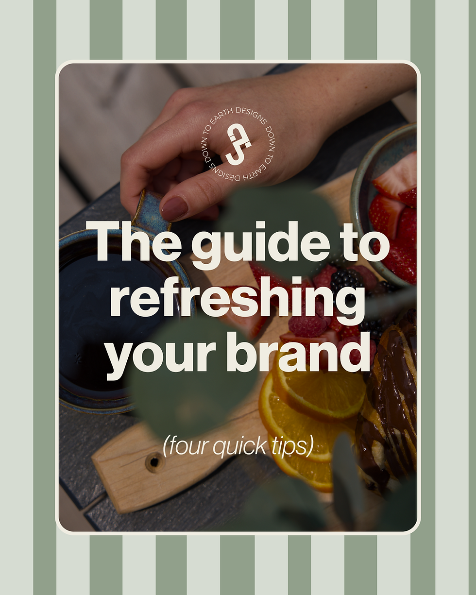
How to Make Your Pilates Brand Feel More Cohesive (4 tips)
- May 15
- 5 min read
Is having a logo enough for your wellness business?
Probably not.
It's a great place to start, but if you want the whole brand to feel cohesive, the visuals supporting it need to go much deeper than just the logo.
A logo can help people recognize your business.
What makes the brand feel complete is everything built around it.
website.
brand materials.
social presence.
physical space
overall feeling people get when they come across your business.
A logo might be finished, but that does not always mean the brand feels fully built yet.
To show you what that looks like in practice, I am using my REFORMR Pilates concept to walk through how to layer a visual brand.
It started with a very simple logo, but the real goal was figuring out how to build a full visual world around it so the brand felt stronger, clearer, and more complete.
If you want your wellness brand to feel more cohesive, these are four ways to bring it to life visually.
Tip 1: Build for the Right Audience
When people think about branding, they usually start and end with a business name and logo.
But if you want the final brand to feel cohesive, the stronger place to start is understanding the who the business is for.
That sounds simple, but it knowing your audience changes everything.
The strongest visual direction usually doesn't come from trendy designs, it is rooted in understanding how you want to connect with, understand and guide your audience.
That was the starting point for the pilates brand REFORMR.
The concept was intentionally built around the brand values:
structure
strength
precision
momentum
The goal was to attract a more intense, city-driven Pilates audience, so the brand could not feel overly feminine, soft, or community-first in the way a lot of studios do.
It needed to feel sharp, disciplined, modern, and a little harder at the edges.
That is what made the darker palette, brutalist references, and stronger typography feel right for the brand.
If you are trying to do this for your own business, start by building a simple user persona by asking these questions:
Who is this for?
What do they care about?
What kind of experience are they looking for?
What would make the brand feel aligned to them, and what would feel completely off?
For REFORMR, that translated into a brand that felt sharper, more disciplined, and more editorial than a lot of the softer visual language already living in the Pilates space.
Once that part is clear, it gets much easier to build a visual world that actually fits them.

Tip 2: Start Building the Brand World
This is the point where the brand starts becoming more than an idea.
Once you know who you are trying to reach, the next step is building out the visual world they would actually want to step into.
That is what the mood board is for.
Not just collecting logo inspiration, but starting to piece together the atmosphere around the brand.
Pinterest is one of my favourite places to do this because it lets you gather references quickly and start noticing what keeps pulling your attention.
And the best part is, you do not have to limit yourself to branding examples.
Start saving anything that helps define the world around the brand, whether that is architecture, interiors, color palettes, outfits, food, photography, or even small lifestyle details that keep pointing back to the same kind of person.
For REFORMR, that meant pulling references like industrial architecture, concrete, city walls, sharp black and white photography, coffee, matcha, workout wear, and more brutalist, editorial design cues.
That board helped define what belonged in the brand world and what did not, and most importantly gave the logo somewhere to live.
And once you start seeing those patterns clearly, it becomes much easier to turn the brand into something that feels specific instead of generic.

Tip 3: Build the Design System
This is the hardest part of any project because it's when you start pulling in every piece of the project together to build that refined brand.
It is one thing to know the feeling you want and collect good references.
It is another thing to turn that direction into a real system the business can keep using again and again.
This is where the visual decisions start becoming more concrete:
typefaces (fonts)
color psychology
textures
patterns
layouts
repeated graphic cues
(this is also usually when someone reaches out to a designer - and yes reach out if you're currently stuck here) These are the pieces that turn a brand from an idea into something recognizable that can be used in signs, social media, marketing materials to the website.
The more intentional you are here, the easier it becomes for the business be recognizable.
For REFORMR, the design system came from a black and white colour palette, sharper typography, repeated structure, and visual elements that could move across physical and digital touch points without losing the original energy.
That is the real job of the system, not to make everything look identical.
But to make everything feel like it belongs together.
If this is where you are currently at with your brand, try to really build a system that would work across many different touch points outside of just a logo.

Tip 4: Make It Easy to Recognize
This is where consistency stops being a design preference and starts becoming a business advantage.
Most people are not going to remember your brand the first time they see it. The will have to see it a minimum of 6-8 times before knowing who you are (with social media it could be 40+ times)
The wellness industry is growing which means there are more businesses, content, and visual competing for attention.
That is what makes good, consistent branding powerful. If you keep showing up with the same kind of clarity and point of view, it becomes much easier to recognize and much harder to ignore.
Branding matters beyond just looking good.
It helps connect your visuals, your marketing, and your sales so people are not meeting a different version of your business every time they come across it.
With REFORMR, that meant carrying the same visual language across the member pass, digital check-in, social assets, and brand materials so each touchpoint kept reinforcing the same brand in someone's mind.
That is what helps a business feel more established.
It is also what gives people something to remember when they are finally ready to pay attention.
What This Means for Your Brand
If your brand still feels a little disconnected, it means that the visual system needs to be built out further with more intentionality.
Because what makes a wellness or pilates brand feel cohesive is not one asset.
It is the way the visuals, the touch points, and the overall experience all start working together.
That is the kind of work I help founders build here at Jaia Studio.
If your business feels stronger than the way it currently looks, this is usually the point where custom branding starts making a real difference.
If you are ready to build a brand that feels:
clearer
cohesive & intentional
recognizable
You can inquire about custom branding here!
View some of our past custom branding projects:


Comments