From Big Idea to Bookable Brand: The Florencia Wellness Case Study
- Jen Drews
- Jul 10
- 4 min read


Last year, I walked into a Starbucks for a client meeting not totally sure where the conversation was going to go.
I had read through the intake form ahead of time, and my first impression was that there was a lot there.
A lot of big ideas... but not a clear starting point for how it all fit together. Over the next hour, I slowly sipped on my americano as I listened to Lydia excitedly tell me about her dream.
She had a vision of connecting pilates with florals and building a community, but there was one small problem - how do you take a dream and make it a reality?
So I asked her, "why can't you do all three?"
That question ended up changing everything.
Lydia didn't need a smaller idea, she needed a foundation strong enough to hold it.
That was the real beginning of Florencia Wellness.
Before there was a name, a brand, or a website, there was a founder with a strong vision and no clear map for how to bring it to life.
Over the course of the next year, that is exactly what we built.
Where We Began: building a wellness brand case study
What made this project so interesting from the beginning was that the vision itself was never the weak point.
Lydia already knew what she wanted Florencia Wellness to feel like.
At first glance, a business like that can look like it just needs the obvious things: a name, a logo, maybe a website. (and yes, it did need all of those pieces.)
But the bigger question was where to begin.
There was no clear visual world, no business name yet, no offer people could immediately understand, and no real system for how someone would discover Florencia Wellness, trust it, and eventually book a class.
That is why the early design work mattered so much.
We were not just making the concept look pretty - we were making it real.
Building out the visuals and the business structure gave Lydia something tangible to shape decisions around, and it gave future clients something they could actually see and respond to.
If a business does not feel real, it is much harder for other people to trust and buy into it.
And in this case, creating a businses direction and visuals was the thing that helped turn Florencia Wellness from a beautiful idea into something people could begin to understand.
Finding the centre of the brand
Through the strategy sessions, we worked out what Florencia Wellness was really centred around and what the core offer needed to be.
Once we stopped looking at movement, florals, and community as separate ideas, the direction started to come together.
That process helped shape the name, the audience, the tone of the brand, and eventually the core offer itself: Petals & Pilates, a signature experience that brought movement, bouquet making, and community into one clear and memorable offering.

Designing the visual world of Florencia Wellness
Once the strategy was clear, the design had a much more specific job to do.
Florencia Wellness could not look like a generic Pilates brand, but it also could not lean so far into florals that it started to feel like a flower shop first. The visual direction needed to hold both sides of the experience together.
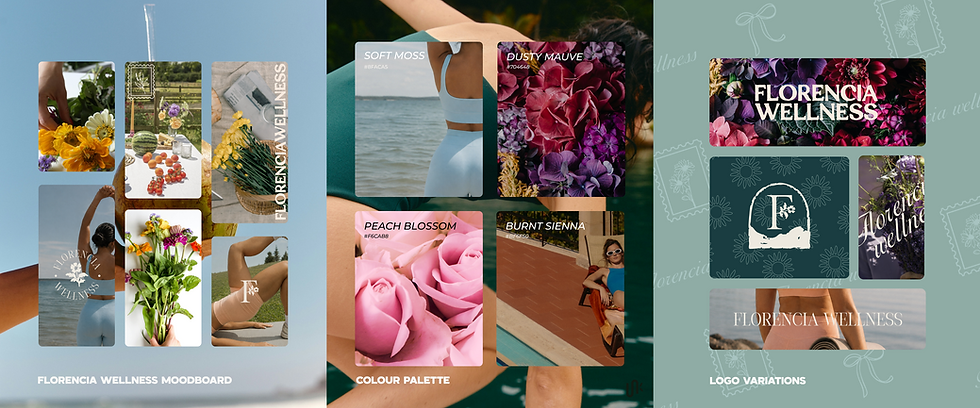
We explored three creative directions, but the one we kept coming back to had this undertone of 'romanticizing your routine'.
Warm colours, floral illustrations, and subtle travel-inspired details gave Florencia Wellness a feminine, grounded feeling that felt welcoming rather than exclusive.
In the end, the visual identity gave the brand its own atmosphere and helped people feel the experience before they had even booked.
When the Florencia Wellness started to feel real
Once the foundation was in place, everything else became easier to build around.
The website gave Florencia Wellness a home, the booking flow made it easier for people to move from interest into action, and the stronger visual direction meant the brand no longer had to be reinvented every time Lydia posted.
Over time, that started to show. Florencia Wellness built a website, grew its social media audience, developed a clearer core offer, and started becoming known for events that felt more thoughtful and memorable.
The clearest sign that everything had really clicked was Petals & Pilates.
It gave the brand something people could immediately understand, remember, and talk about, while holding together movement, bouquet making, and connection in a way that felt natural instead of forced.

What the First year proved
A year ago, this was a Starbucks conversation about whether all of those pieces could really live together in one brand.
A year later, Petals & Pilates is not only the signature offer, but also the name of Florencia Wellness's one-year anniversary event on July 19.
That full-circle moment says a lot.
What feels most meaningful is not just that Florencia Wellness now has a brand, a website, a booking flow, and a stronger social presence, but that all of those things helped the business become easier for people to find, understand, and say yes to.
In one of our more recent meetings, Lydia said something that brought the whole project back into focus, she said:
"failure isn't hosting an event where only a few people show up. Failure would be someone leaving the room without feeling welcomed, cared for, or connected to the community"
That is the heart of Florencia Wellness.
The brand gave the vision structure, and Lydia is the one bringing it to life.
Want to explore more of Jaia Studio's designs?


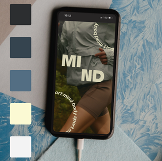


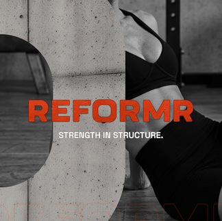


Jaia Studio specializes in health, wellness and fitness branding and business strategy.
If you are looking to take your brand to the next level, contact us to see how we can bring your ideas to life.

Comments